Church finder
A comprehensive location and directions app for Seventh-day Adventist churches in the UK and Ireland
Context
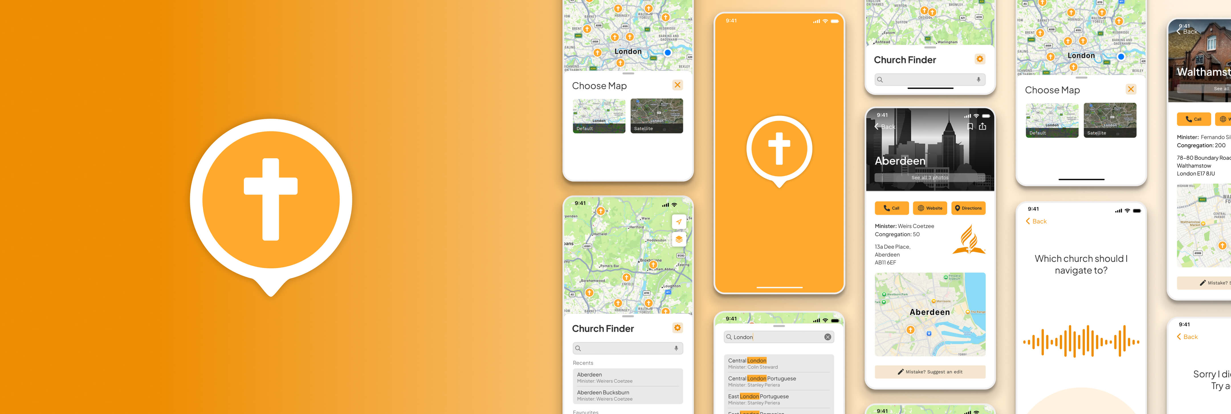
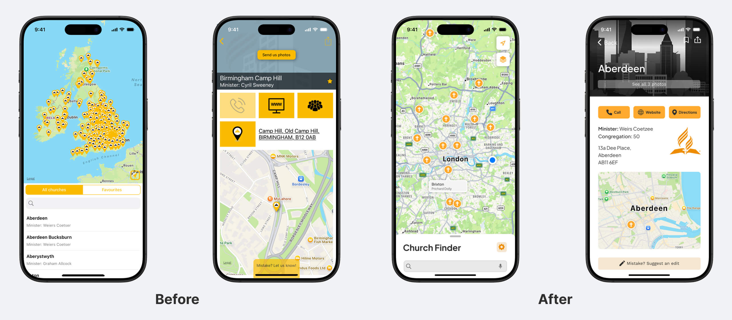
The church finder app on iOs is the single application for finding and getting directions to Seventh-day Adventist churches in the UK and Ireland. Whilst it does it’s purpose, I have found as a user, pain-points which I felt could be improved upon as well as giving the app a visual refresh, which it really needed.
Problem
Overall visual design of original app feels cluttered and has compromised legibility. Interface elements are buggy with elements getting stuck e.g. bar gets stuck at size of entries added. Default map is overwhelming as it shows entire region. Accessing turn by turn takes more steps than necessary. User has to select their choice of map every time they initiate directions.
Solution
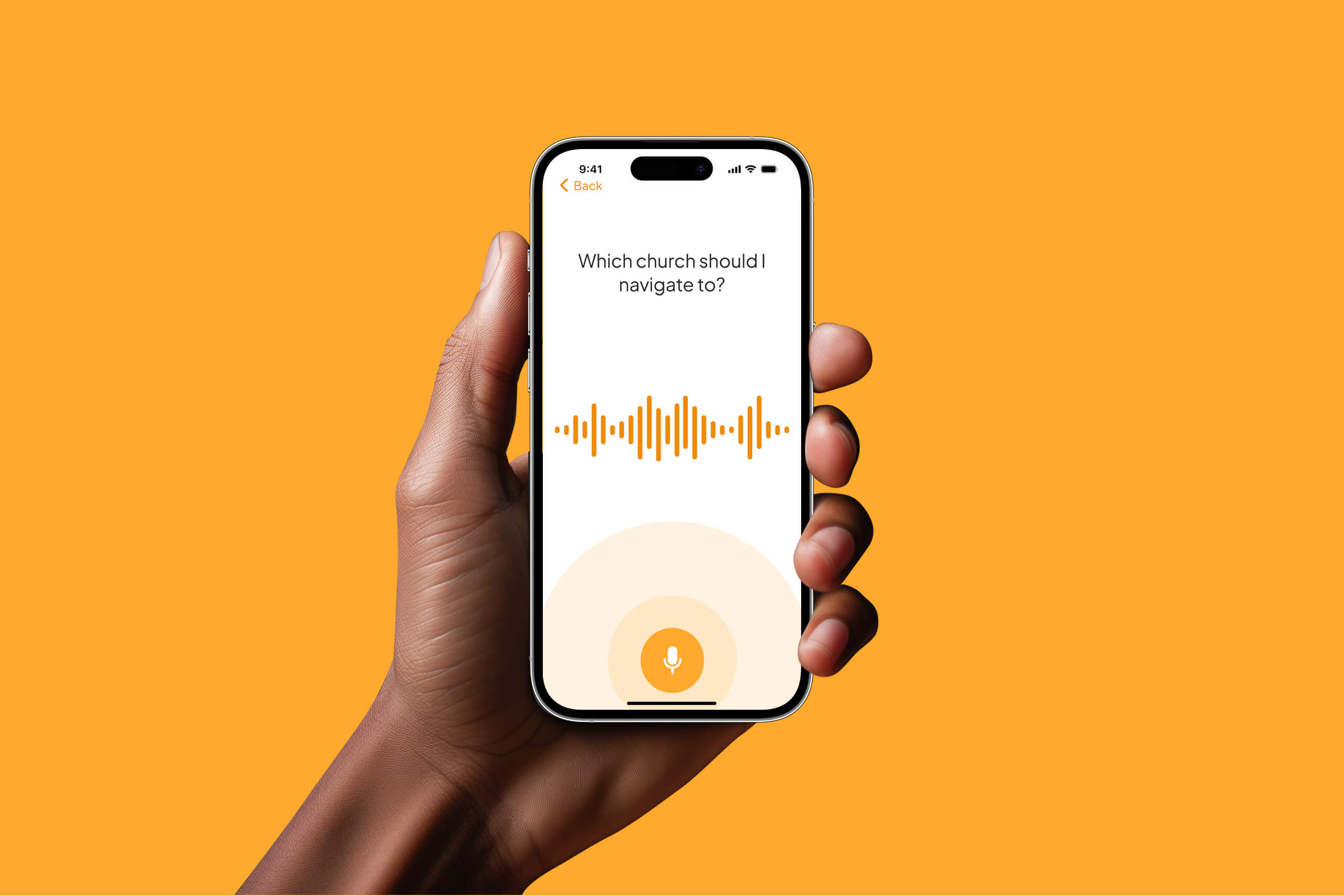
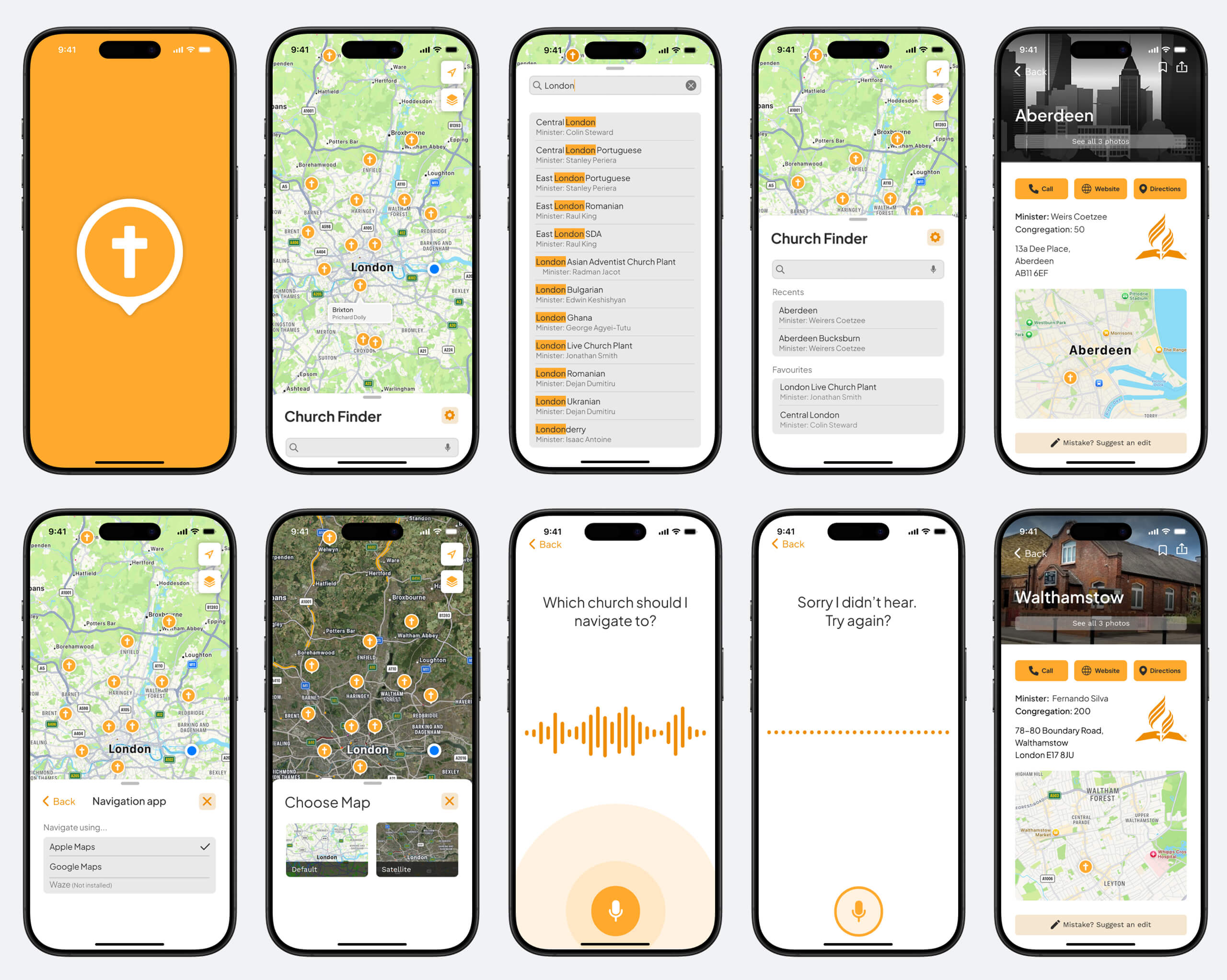
Overhaul visual design and improve legibility. Search bar main overlay should be moveable (pullable). Design map so that it defaults to location of user. Add voice ui feature to quickly go to turn-by-turn navigation to reduce the number of steps to get to turn-by-turn navigation. Currently, it takes 5 steps this could be reduced to 3 steps. Allow user to set default map option for turn-by-turn navigation.
Competitive analysis
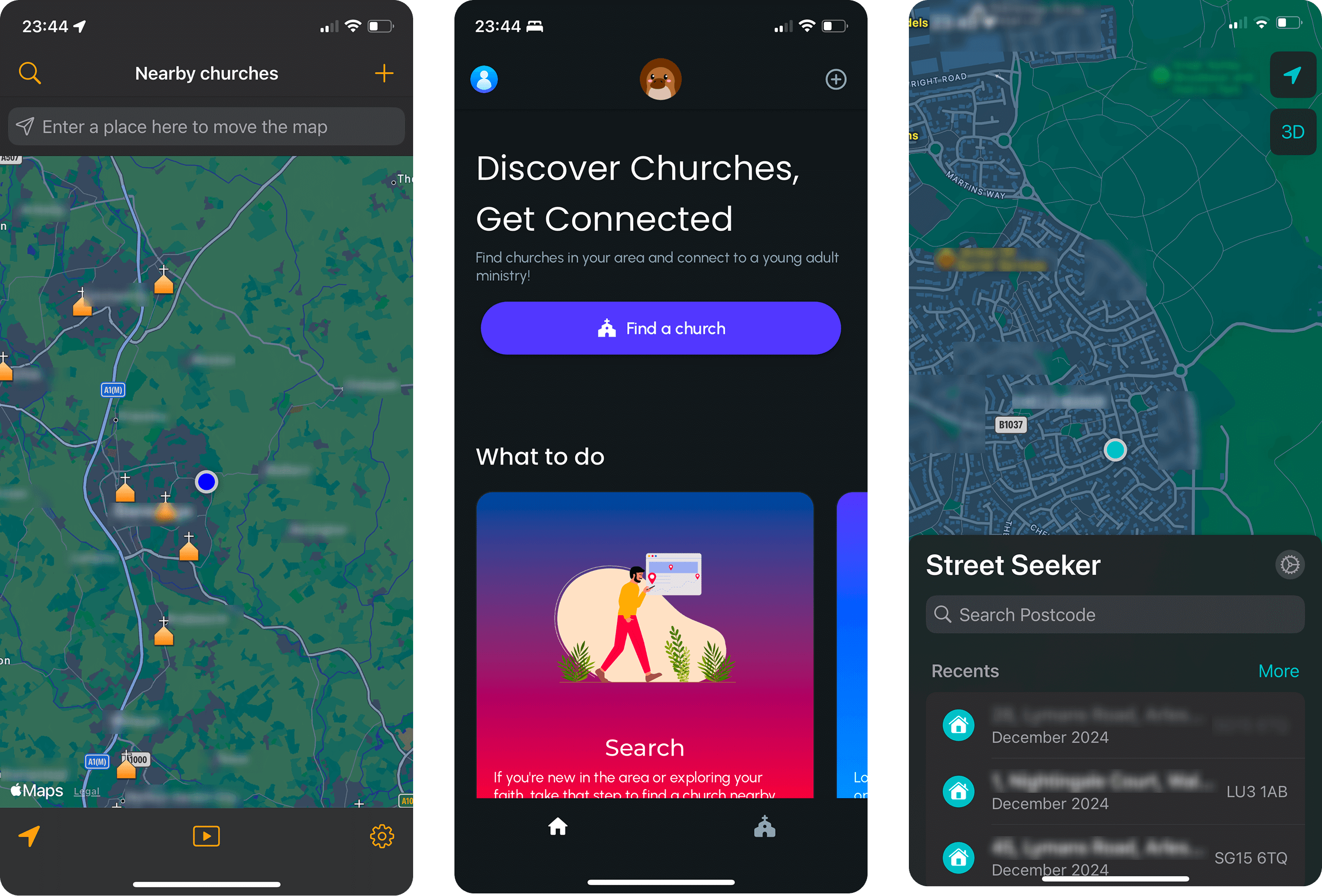
I looked at three other apps with similar functionality, two were other church finding apps and one was more of a street locator app. The intention was to investigate the approach taken, identify solutions to some of the problems I identified, if there were any exemplified in these apps and lastly approaches to avoid.
The good
The Catholic Mass app defaults to the location of the user. The Street seeker app has a move-able main overlay which is pull-able. I also like the recents feature in the street seeker and the position of arrow icon for reorienting to the user’s location.
The bad
The PLATIPUS app welcome screen wouldn’t be relevant to the app I intend to create, where it is more important to get straight to the functionality. The Catholic Mass app has the search bar fixed as well as the bottom menu, which uses too much screen real-estate.
Flow Diagram
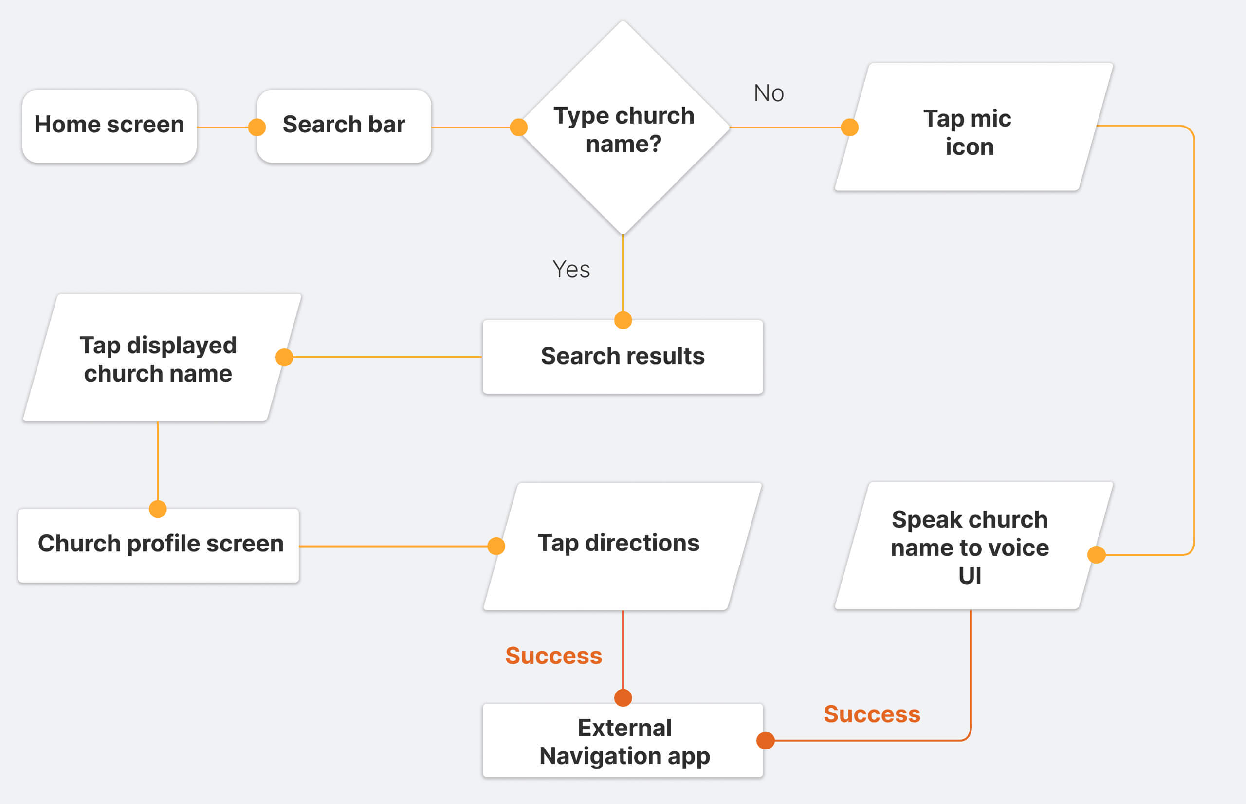
To outline all the necessary functionality I created a simple flow diagram of the main tasks that the user can do. One of the flows is featured below:
High-fidelity wire frames
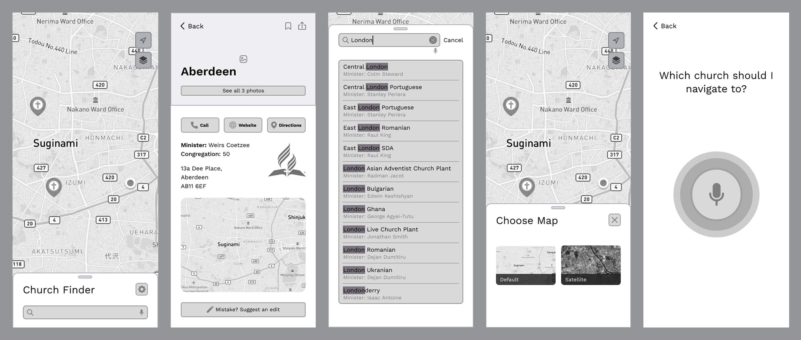
In order to visualise the webpages with reference to their functionality I developed some high-fidelity wireframes. These can be seen below:
High fidelity UI Design
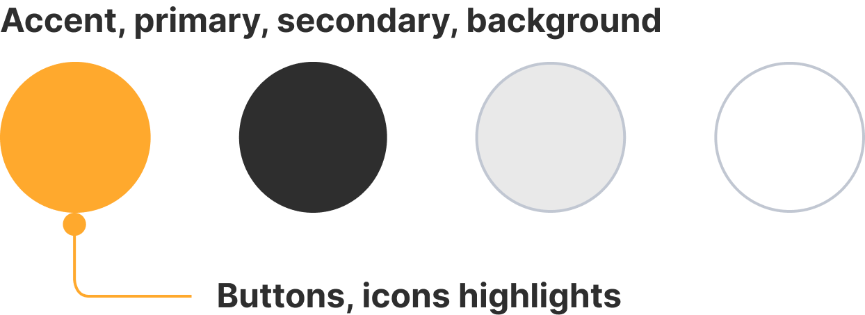
The basis for the visual style drew from a colour scheme that could be found in the brand guidelines for the church organization. The colour palette is fairly extensive, allowing for various options, however I settled on the yellow scheme. The original app also used this scheme, however I found that this scheme worked the best also in the redesign. I looked at various map apps and directory apps in addition to the ones above and also apps using voice search to gain inspiration for approaches that work well and best practice.
Colour palette
Font
App icon